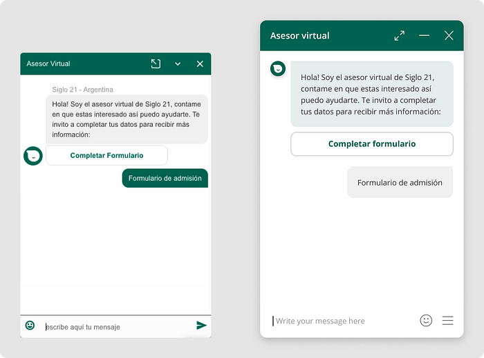
Avio: Chatbot Window Redesign — High Impact at a Low Cost
--
One of the main products of Aivo is its chatbot window. It is the one that has the most views and interactions from users and transmits the voice and brand of our customers during each conversation.
It was a product that visually looked outdated, due to the UI failures it generated UX complications, against the competition it seemed to be worse due to the look and feel it had, and customers did not have a tool to accompany their new and innovative products.
This led us to work on the redesign of the chat window. With a reduced Design and Development team, we focus on being able to generate high impact at a low cost.

The redesign work took place between February and March 2021, and the implementation between March and April. The redesign went into production in April 2021.
The challenge
Aivo’s clients are companies from very different industries, and thus they have very varied users so the chat window becomes a very sensitive point of interaction with infinite variables.
This means that the changes made must be extremely secure or progressively be made with smaller validations.
The feedback that we had been collecting from clients was that the window interface was “outdated” and that the competition seemed to have better and more aesthetic products.
On this basis, we had a team of two designers and two developers covering more projects in addition to this one, so resources were few and time was scarce as we couldn’t be 100% dedicated to this task.
This context framed a big challenge on which we should make improvements to the experience and interface, with a low development cost and without making drastic and sudden changes in order to not affect our clients.
The process
Benchmarks
We started by benchmarking our own product to understand all the possible cases to analyze, where we found friction in the experience, what were the most critical aspects of the interface, and what were the opportunities for improvement in general.

At the same time, we carry out a benchmark on our competitors, looking for specific improvement opportunities and understanding the look and feel to which the industry is tending.

Insights and prioritization
In addition to the feedback we already had from our clients for window improvements, we added all the points identified in the benchmark.
We began to work on a prioritization matrix to define how to tackle the redesign and modification of some features.

Recalculating
After analyzing all the features and improvements, we saw that we could divide the redesign into two stages:
- Focusing on the interface and current experience, without adding/modifying features
- Focusing on giving more power and scope to the window by adding and modifying features
Due to the context raised at the beginning, we decided to go for the first option: Improve the interface and experience with the current features.
Explorations
Before starting to redesign each component and the window in general, we opened the way to work on explorations based on interesting points that we saw during the industry benchmark.
We started working with the objective of arriving at 3 exploratory proposals:
A trendy and disruptive proposal

A more classic Clean proposal but minimalist in terms of resources

A Refresh proposal based on the style of the current window

The redesign
We took some characteristics from each exploration to define the changes at the UI level while improving the overall window experience.
Some key points that we consider tackling:
- Webfont is better adapted to different browsers and devices to facilitate reading.
- Window size from 300x450 to 320x500 with more space for interactions with components and message writing space.
- Identify the bot’s messages with the color of the brand.
- Eliminate extra texts and content that make reading difficult.
- Define grids and spaces to improve the structure of the window and make it easier to read.
- More visible and hierarchical buttons.
- Forms with more space and contrast between fields facilitate the entry of information.
- Secondary FAQ window with a design that represents that it is auxiliary to the main one.
- Satisfaction surveys with more space and clarity to choose options and leave comments
In this video, it can be seen a general summary of the changes accompanied by how they visually impact.
For the implementation of these changes, we worked side by side with the development team supporting queries and making adjustments based on obstacles that could be found from the code.
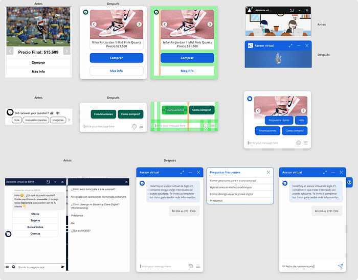
More in detail some examples of components

Examples of the change on our clients’ sites

Comparison of our window vs the competition identified in the initial benchmark

To see and test the redesigned window you can access Aivo’s website or see how it’s being replicated in other cases in our clients’ websites.
Impact
The feedback from our clients and stakeholders was largely positive. It is important to highlight that the redesign did not imply that they should make any changes to their bots or settings.
Regarding the measurement of metrics, they improved in general over the window, and here we can see an example of the responses in the window satisfaction surveys, which rose 35% in relation to the average of previous weeks.

Other metrics showed increases in conversion rates for key plugins such as buttons, forms, and carousels.
The next steps for the project involve maintenance and making sure that the changes are performing well in all the cases of our clients, and in starting to plan in the future the implementation of new features for a continuous improvement of the window.
Conclusions
To conclude with the case, it is important to mention that this work was carried out in conjunction with the other designer of the company, Fede Menchaca, and it was possible to implement it thanks to the development and project management team of Aivo.
We highlight the importance of finding a balance between the speed of technology companies and the desire to make an “ideal” design. It is important to find the right point that allows us to add value quickly and scale the product in a stable and organized way for our company, friendly for customers, and beneficial for users.
Thank you for reading!
Nico Shuga
